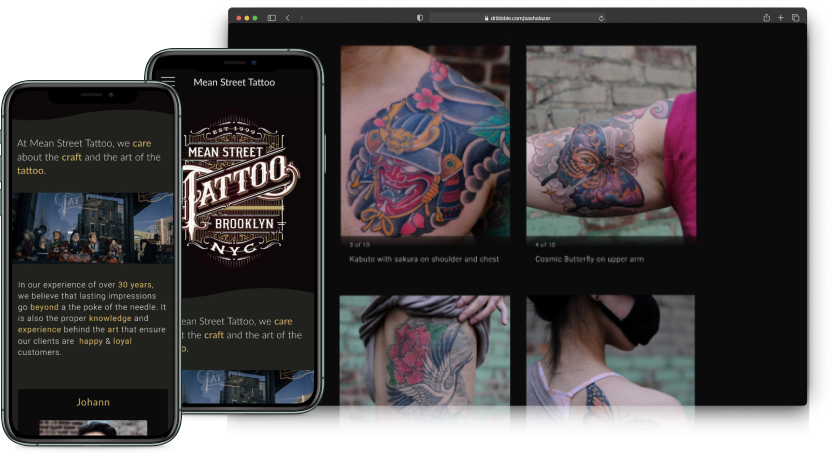
Mean Street Tattoo
A responsive website design for a tattoo shop, where the artists can showcase their work and allow their clients to book appointments.
Overview
With the growing acceptance of tattoos within the workplace, and within society at large, customers are increasingly looking to book appointments with shops that are inclusive and easy to communicate with.
Problem
How to create a modern website with a focus on increasing client engagement?
Solution
Create an updated style guide and UI kit, provide a clear information architecture for the site, drive clients to view each artist page, and embed a consultation form on the website.
Project Background
Mean Street Tattoo is a tattoo shop located in Brooklyn, NY. The shop's contracted web developer has agreed to collaborate with me to update the current site.
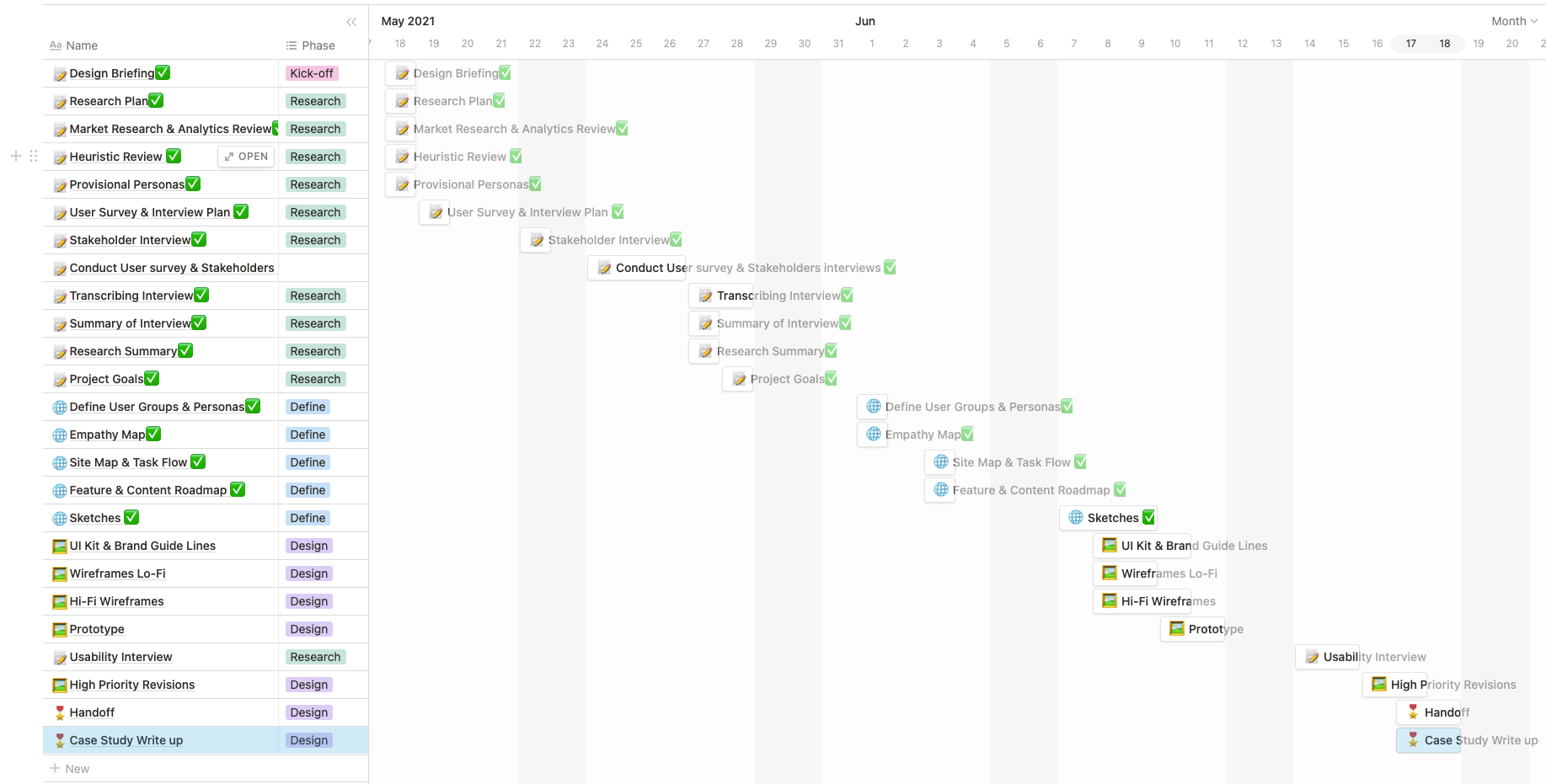
Project Duration
May - June 2021
Team
Morgan Nebiosini
- UX Research
- UX Design
- UI Design
- Web Development
Project Planning
I used Notion to get set up for my design project. Having a solid organization was essential in maintaining a tight schedule. Within Notion, I provided myself one week for each UX design phase while still giving myself time to ideate and reflect on the work I completed in the previous phase.
Research
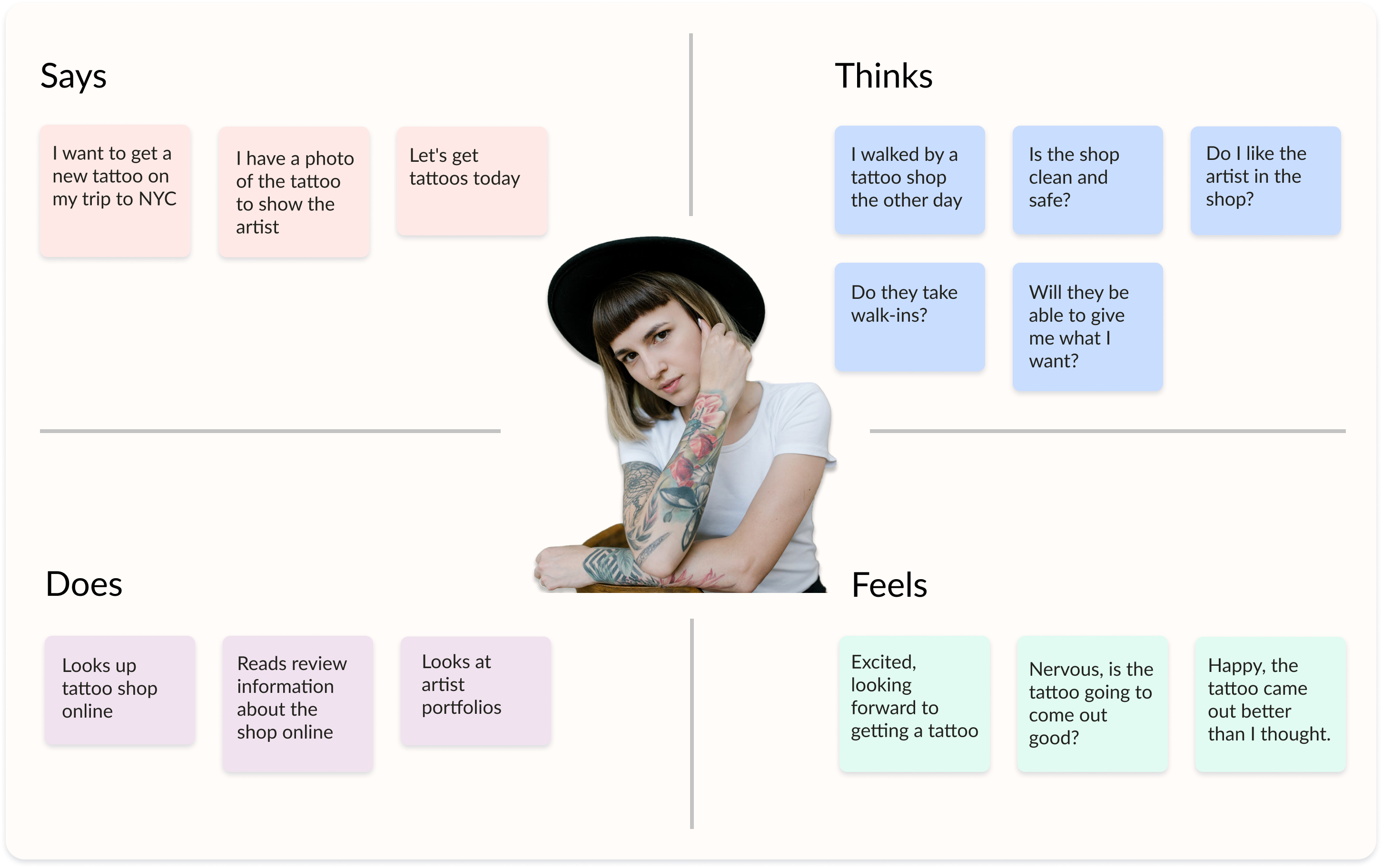
Learning from potential users
I met with five individuals interested in getting a new tattoo, to find out what users wanted to know before booking an appointment, as well as to see how they would interact with the current website.
The interviews were conducted over Zoom and included a contextual portion where participants screen shared their navigation of the website.
What I learned during the user interviews:
- Users are primarily interested in seeing the tattoo artist portfolios
- Users want to learn more about a tattoo artist's personality before booking for an appointment
- When communicating with the tattoo artists, all of the users I interviewed preferred using email or Instagram over directly calling the tattoo shop
What I learned during contextual interviews:
- Users felt the current website looked outdated
- Users were unsure of how to contact the tattoo artists or the shop itself
- After viewing the website, users felt unsure about requesting an appointment
The Power of Instagram
- All of the users I interviewed said that they start their search for a tattoo artist on Instagram.
- If the artist's profile didn't include a link to the shop, they would then do a Google search for the shop itself.
- The intention here was for the users to figure out if they'd feel comfortable booking an appointment at this shop, specifically with the artist whose work they had viewed on Instagram.
Define
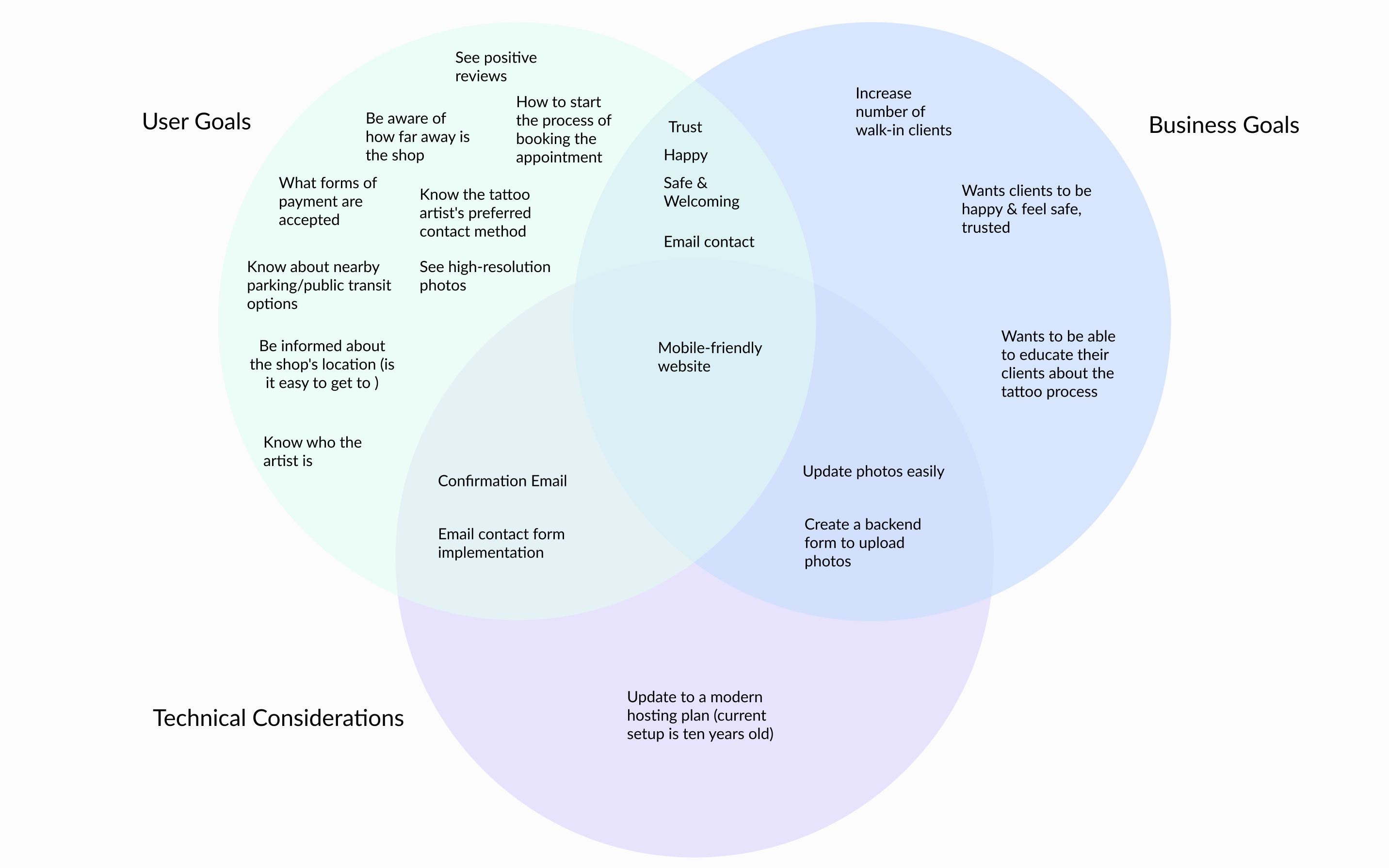
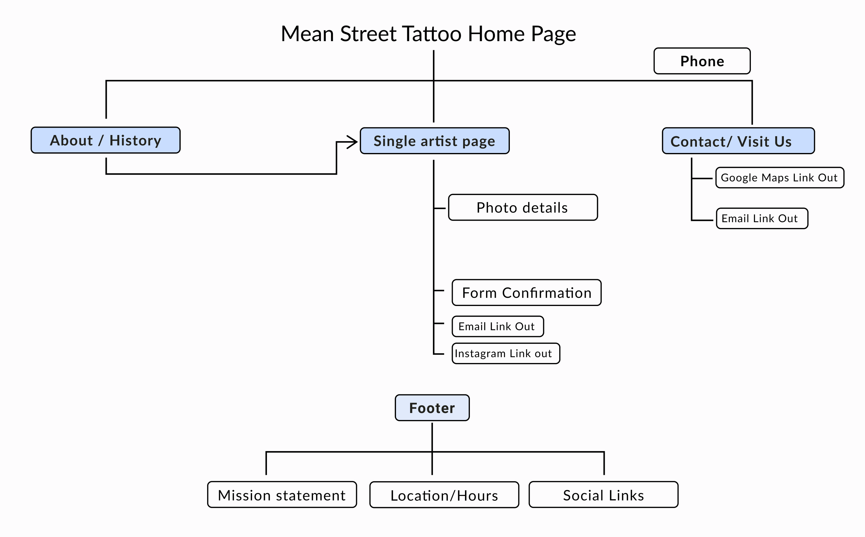
Developing the Information Architecture of the Website
A list of requirements for each page of the website was created alongside a site map, to best discover what needed to be on each page.
- An About Us page with the tattoo shop's history, along with more details about the shop's practices and policies
- The individual tattoo artist pages which would include a photo gallery, consultation request form, and their Instagram feed
- A Visit Us page with Google Maps integration, and some curated information about places to check out in the tattoo shop's surrounding neighborhood
Putting it all together
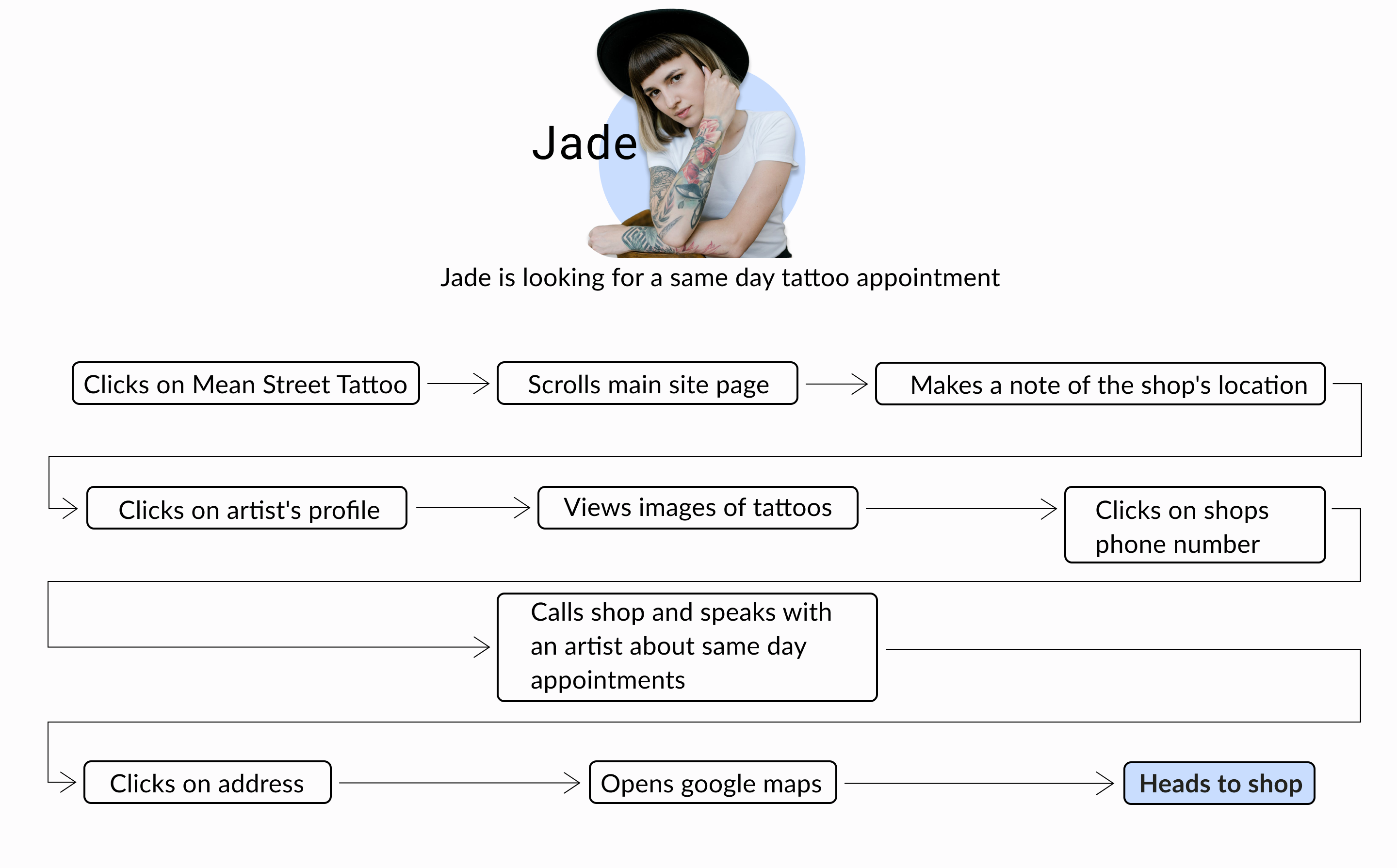
- The final design for the tattoo shop drives users to view the artist portfolio pages, and allows them to easily book a consultation
- Users are still able to call the shop directly, and are prompted to do so for booking same-day appointments
- Users can easily find contact information, the tattoo shop's location, and directions to get there
Validate
Testing out the design
I met with five users to conduct usability testing.
Success!
- All users were able to easily navigate to the form to reqeust a consultation with one of the artists
- All users were able to quickly locate the shop's location details
- Several users stated that they would be interested in scheduling an appointment after viewing the tattoo artist portfolios
- All users expressed that they felt comfortable booking an appointment with the tattoo shop
- When I asked users to book a consultation, a few of them navigated to the Contact Us page instead of using the consultation forms on the tattoo artist profile pages
The Revisions I Made:
- During the test, I noticed several improvements that could be made to the overall look of the site, such as minor adjustments to the padding and content alignment
- I made minimal changes to the visuals of the design after the usability testing concluded
- I added a link on the Contact Us page to redirect users to the consultation form
Final Design
Summary
The website for Mean Street Tattoo is currently awaiting implemention of the design shown in this case study.
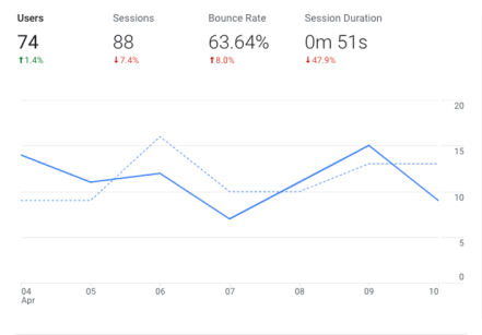
Measuring the impact
Some of the metrics we'd want to track once the redesign is launched:
- Has the bounce rate dropped below 50%?
- Have the number of booked consultation increased?
- Have the number of walk-in appointments increased?
What I learned
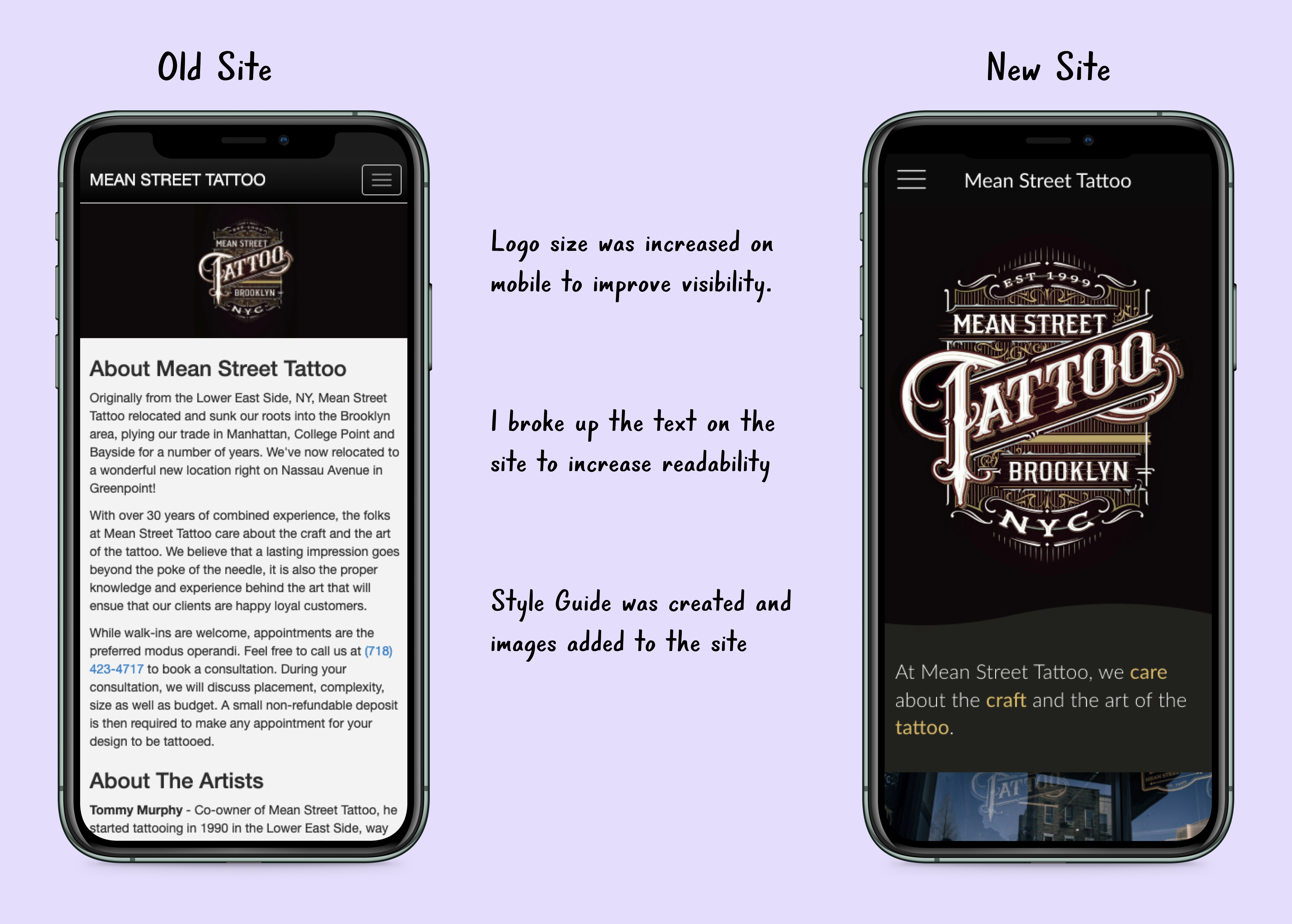
- Keeping the website's style simple was vital to creating a user-friendly experience that prioritized the work of the tattoo artists.
- Breaking up information helps users access what they are looking for much quicker.
- User make quick decisions on whether they want to engage with a business based on how their website looks.
Thanks for reading!
Here's a few more of my case studies.
Disney+ and Marvel
A design for integrating the Marvel Unlimited comics service into the Disney+ streaming platform, to engage a new demographic of readers.