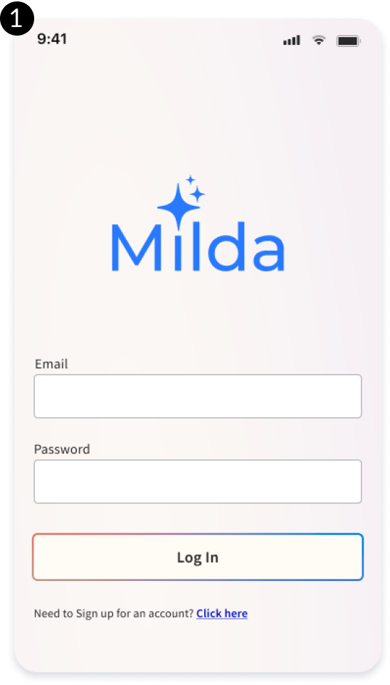
Milda
A mobile app design for organizing cosmetic collections.
Overview
This app idea was born out of a discussion with a friend, who is a Product Manager, about the tracking and organization of cosmetics. Our primary assumption was that users often forget what products they already own, might not be aware of expiration dates, or might simply not follow them. Together, we set out to collaborate on creating an app to solve these problems.
Problem
How to help users be more aware of what cosmetic items they own?
Solution
Create a mobile application that allows users to input their current collection and provide information regarding expiration dates.
Project Duration
July - August 2021, around 35 hours per week for 4 weeks
Team
Morgan Nebiosini
- UX Research
- UX Design
- UI Design
Alex J.
- Product Manager
Research
Market Research
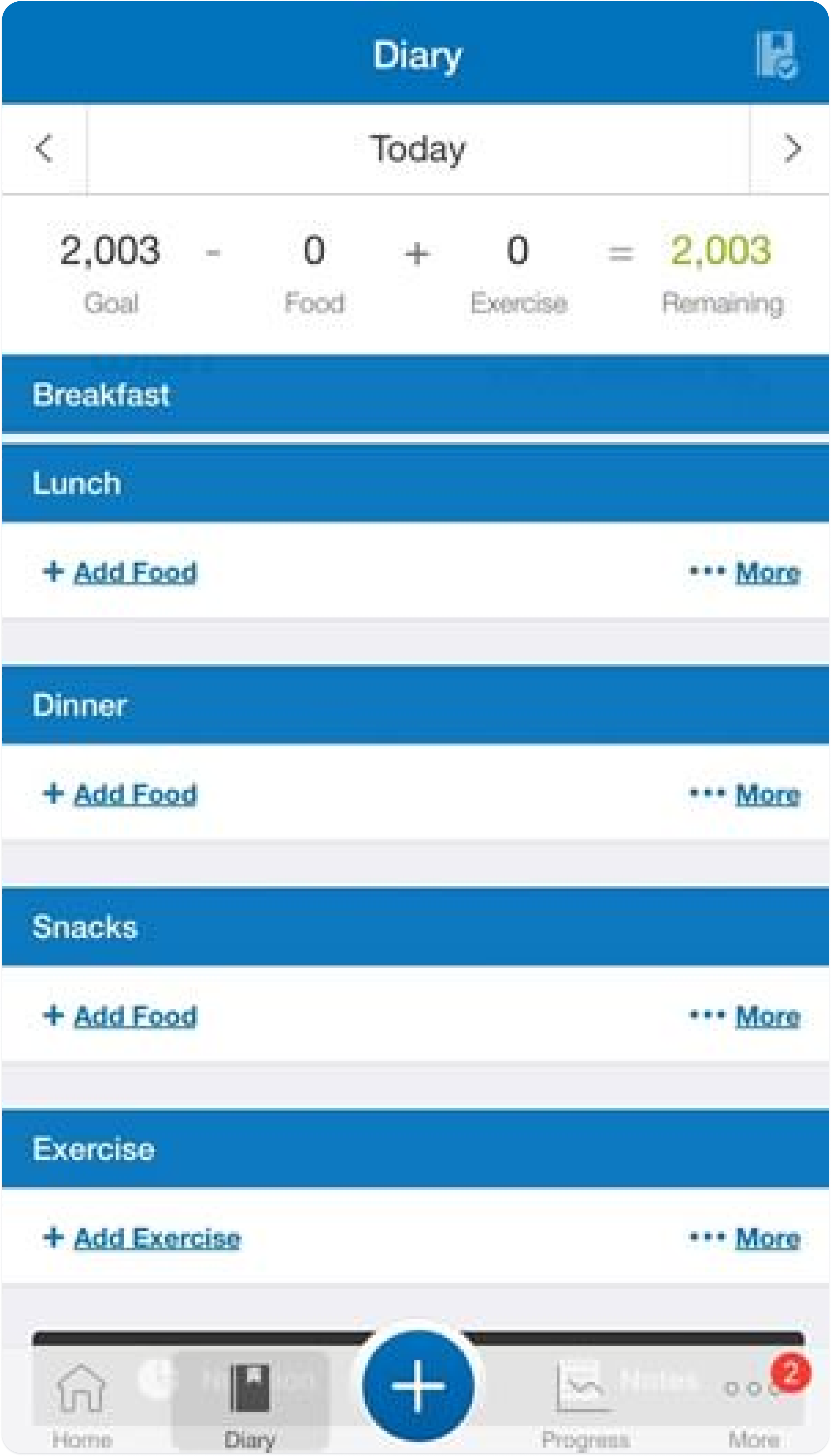
The design of video game inventory systems inspired how I wanted to display information within the Milda app. I began by collecting reference images of several video games whose inventory systems I've enjoyed using. I also referenced existing inventory apps to see what sort of design patterns were commonly used.
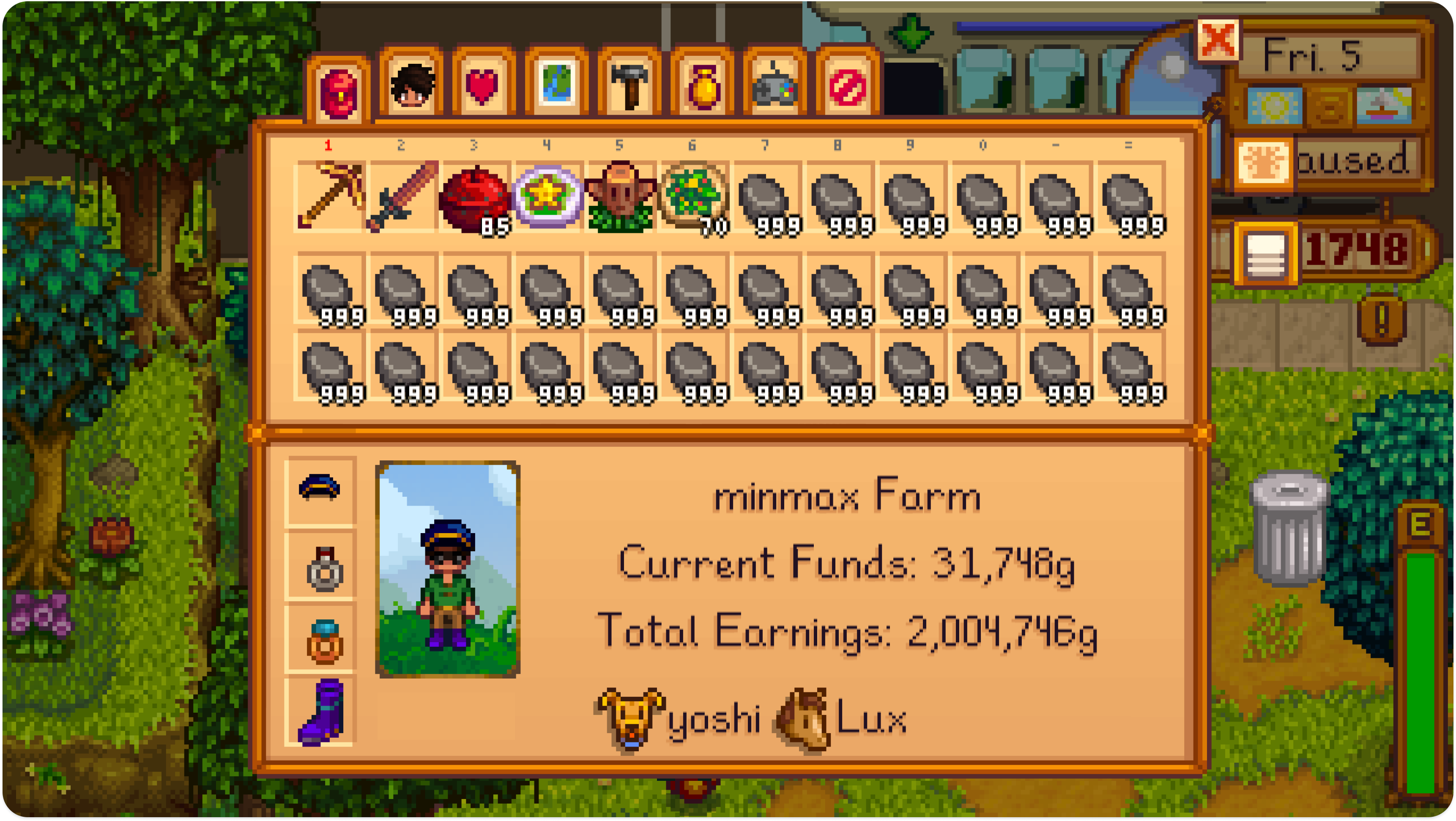
Stardew Valley
Stardew Valley is a simulation RPG. Its inventory system displays information about the player's current stats and items.
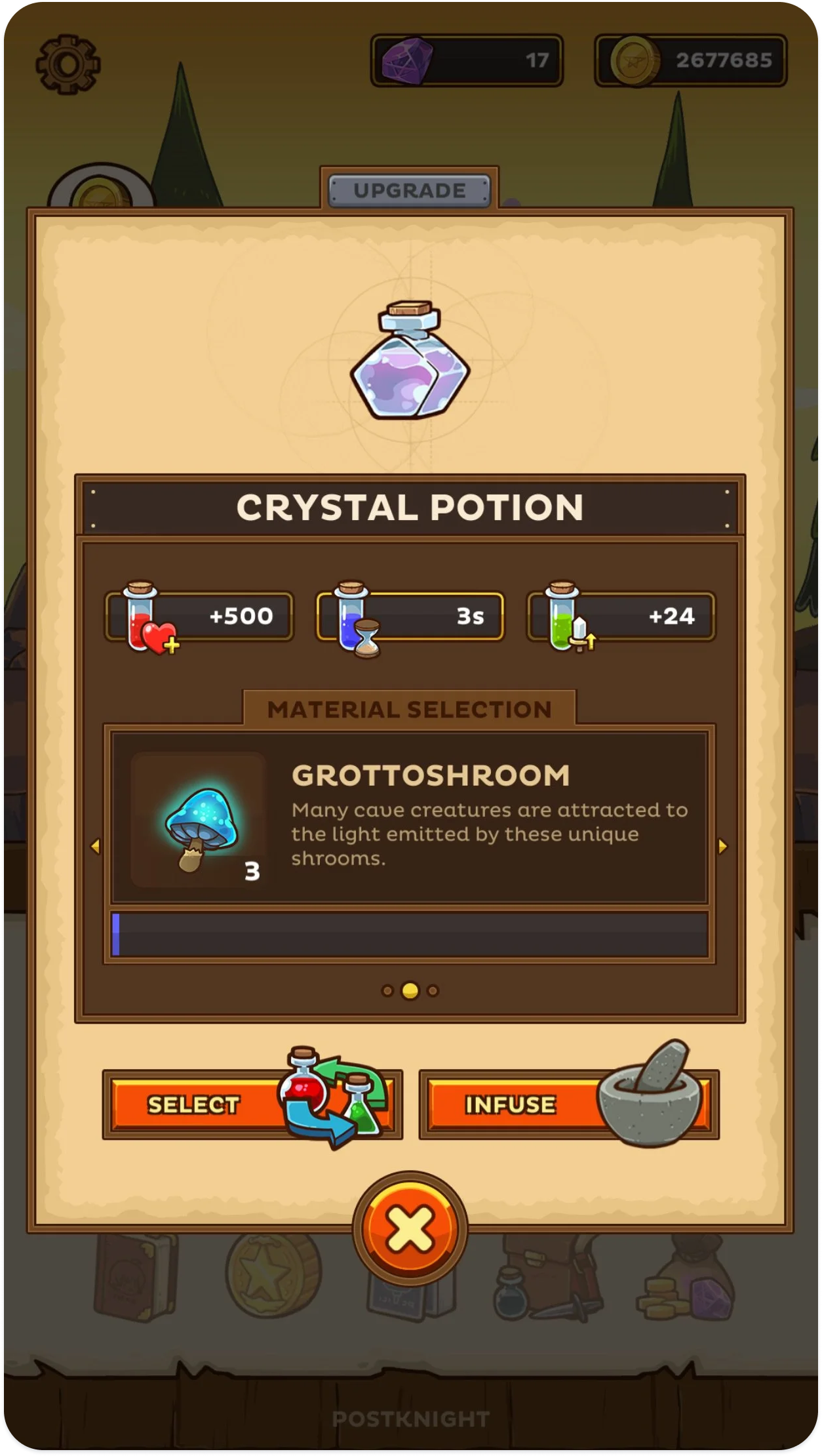
Postknight
Postknight is a RPG mobile app that does a great job at visually displaying important information in an inventory system.
User Research
The Product Manager and I wanted to find out if there were a large number of people that experienced frustration in dealing with their cosmetic inventories. The two of us met to discuss our initial plans for this research, and then jointly conducted several one-on-one interviews. The rest of the interviews past this point were conducted solely by me.
What we wanted to learn
- Confirm whether users have problems with remembering what products they own
- Confirm whether users misplace their products
- Confirm whether users are aware of the expiration dates of their makeup
- Confirm whether users felt or noticed they were spending more than they would like on cosmetic purchases due to the above, ie. duplicate purchases due to not remembering what they already owned or due to misplaced or expired makeup
What we learned
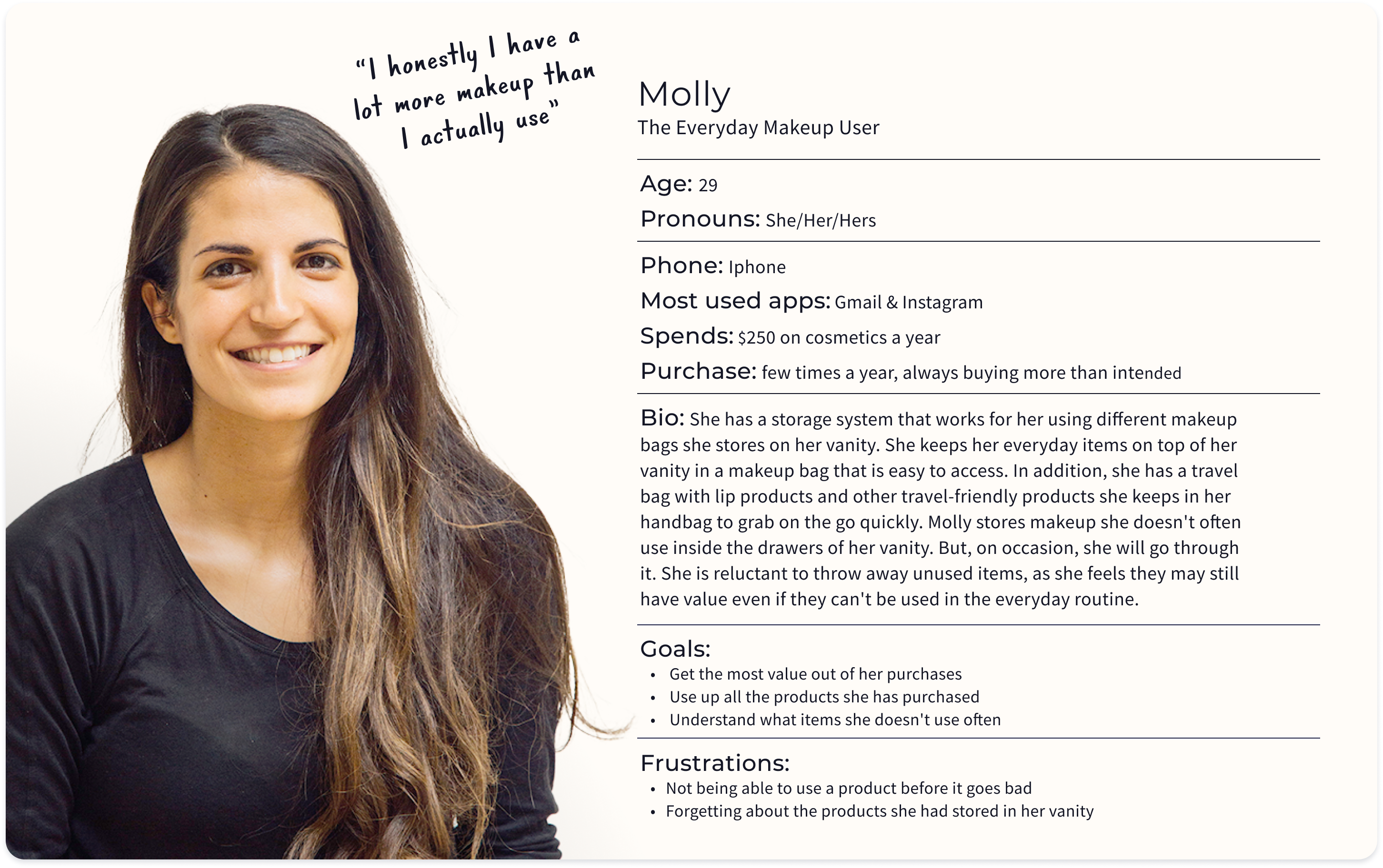
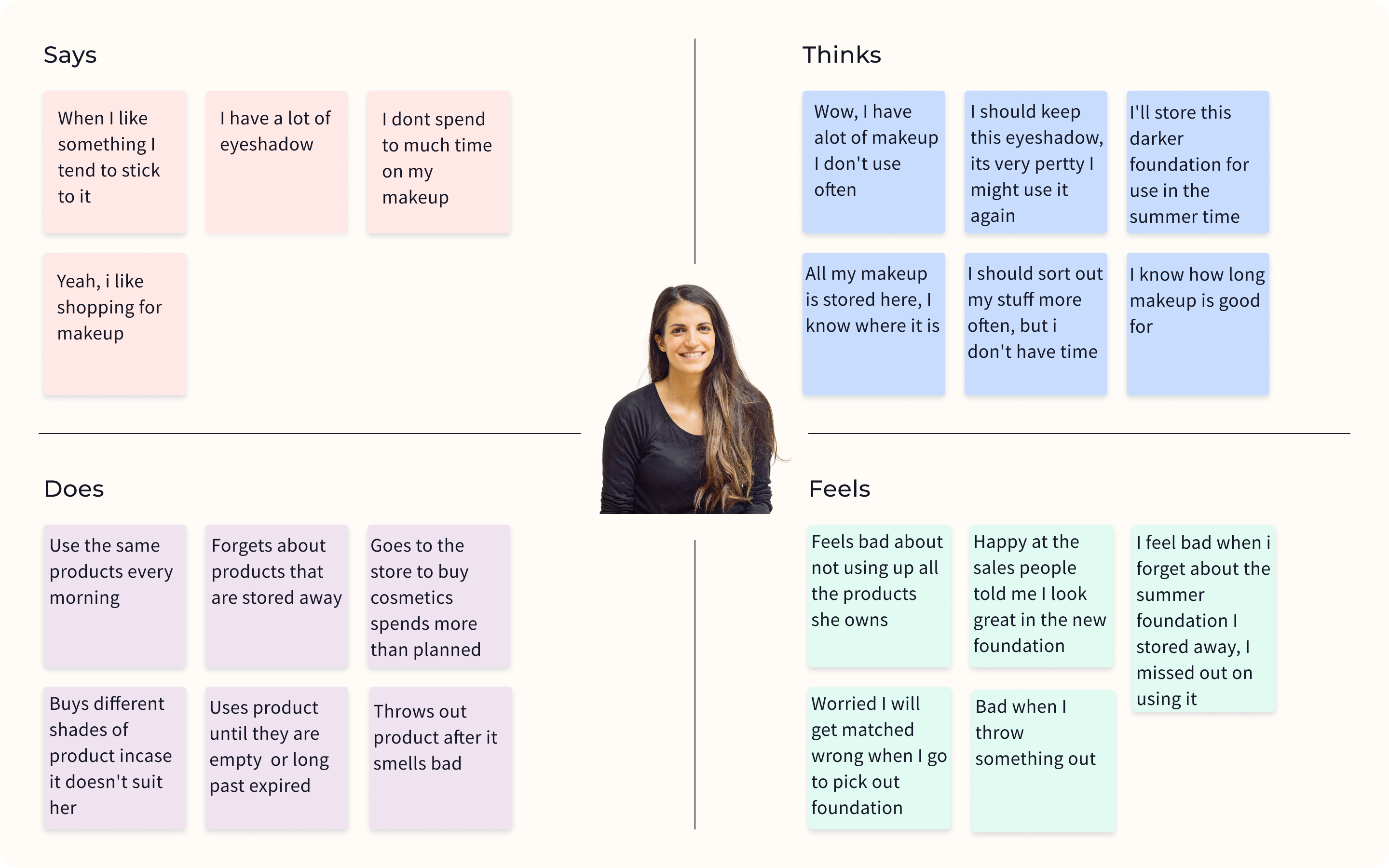
- Users often forgot to use items they had stored in drawers. They didn't forget the items they were using every day.
- Users were not misplacing items. However, two users reported forgetting about some of the eyeshadow palettes they owned.
- Users weren't forgetting where they were storing items, and had a general idea of what they owned.
- Users reported wanting to use an item up before getting rid of it. However, this wouldn't prevent them buying additional similar products.
- Most users expressed guilt about buying an item and not using it.
Findings from the user surveys
- 75% of people who participated in the survey were between 24 to 34 years of age
- 100% used she/her pronouns and identified as female
- 43% spent $250 or more on cosmetics per year
- 73% reported forgetting to make use of cosmetics they already owned
Key Findings
All users knew that their cosmetic products have expiration dates, but would keep items well past that date if there was still product left in the containers. Users would most often keep items such as foundation and eyeshadows for years.
Many users were using their products until the containers were empty, as they valued the money they had spent on the item, even if they didn't use it daily, because they didn't want it to feel like a wasted purchase.
All surveyed users reported forgetting about some of the items they owned, with 80% of them reporting not making full use of some items.
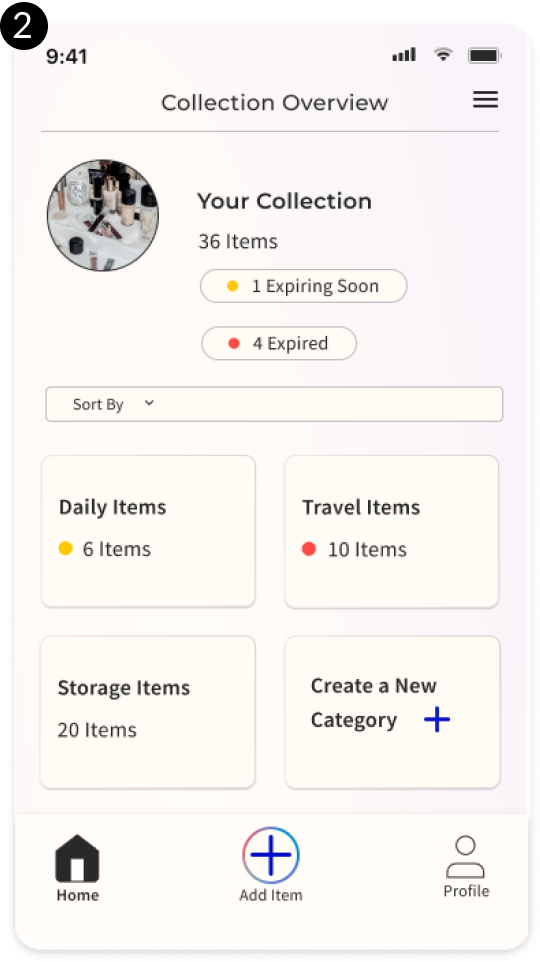
All users had a storage system for their cosmetics, with collections broken up into several common groupings:
- travel items (in a small bag that is inside a handbag)
- daily items that are either left out on top of a counter or stored in a mid-sized pouch
- other items they didn't often use, which were stored out of sign in drawers or bags they didn't access often
Define & Design
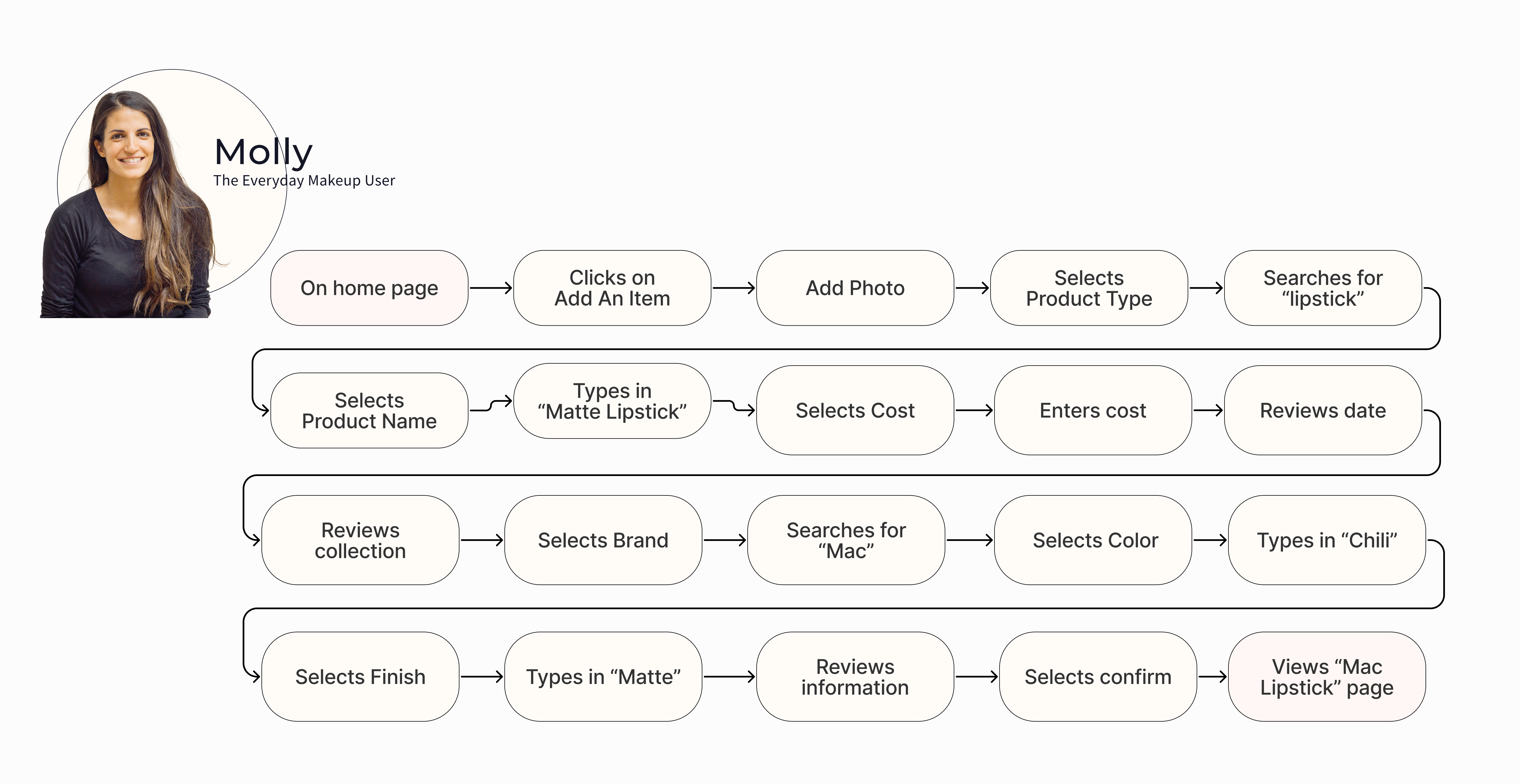
User Journey
I created a user journey for Molly, showing her taking the happy path through the app, to work out the correct user flow.
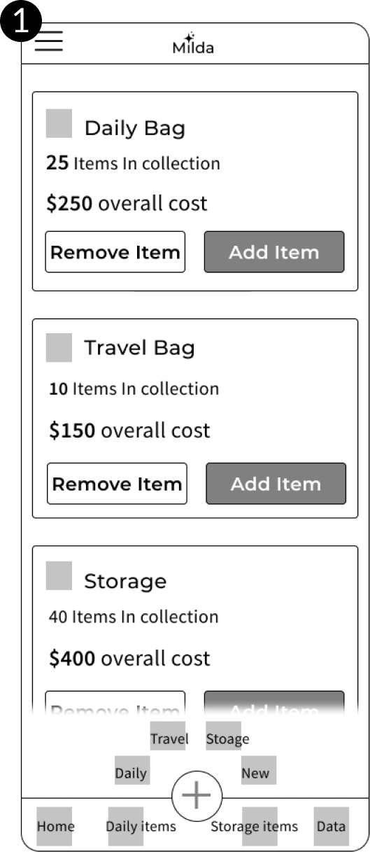
Wireframes
I created several different wireframes for this project. By this time, the Product Manager and I were meeting once a week to discuss the progress on the app design, and any pain points I had run into. I made wireframe adjustments along the way as we discussed the issues together.
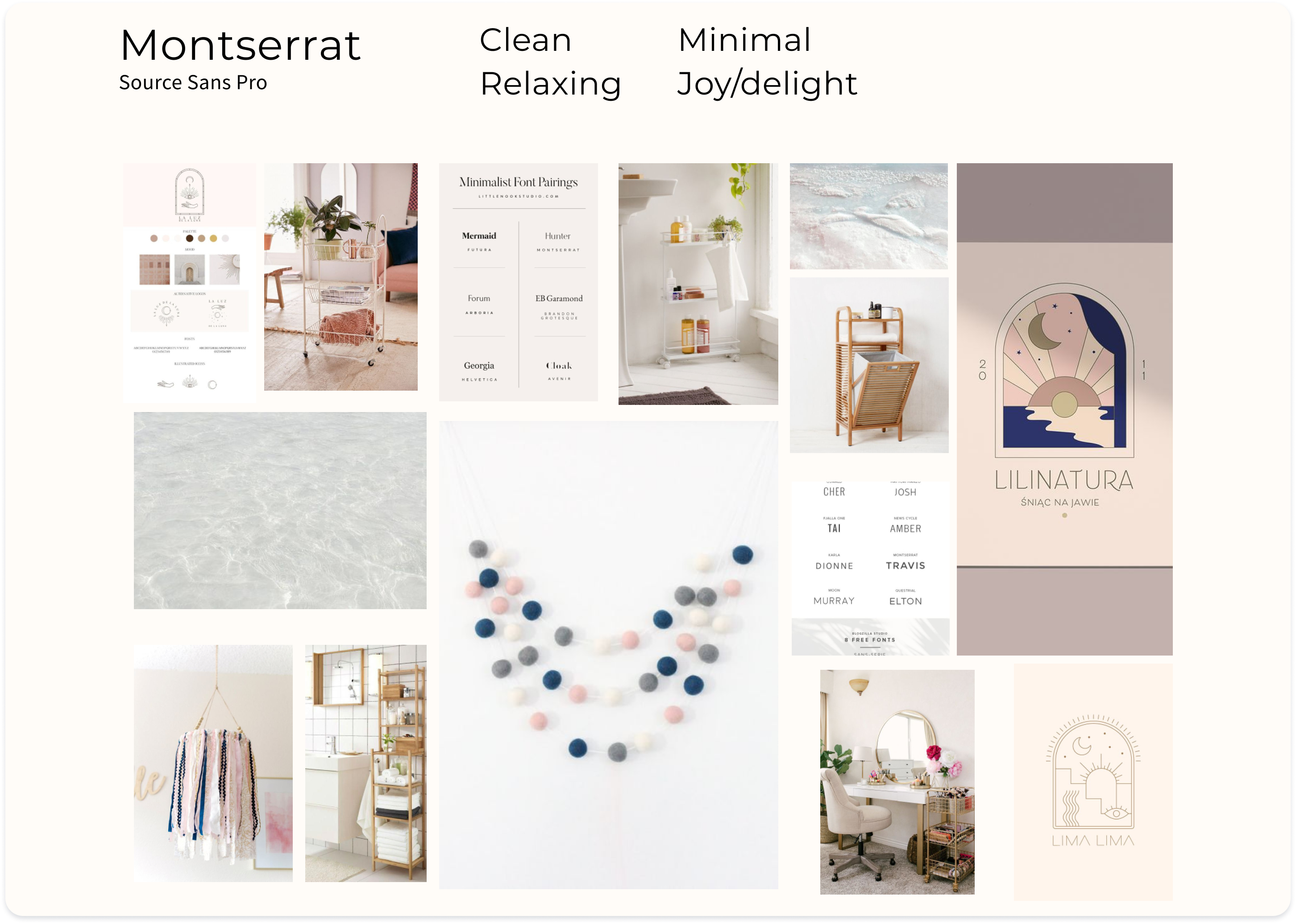
Redoing the Branding
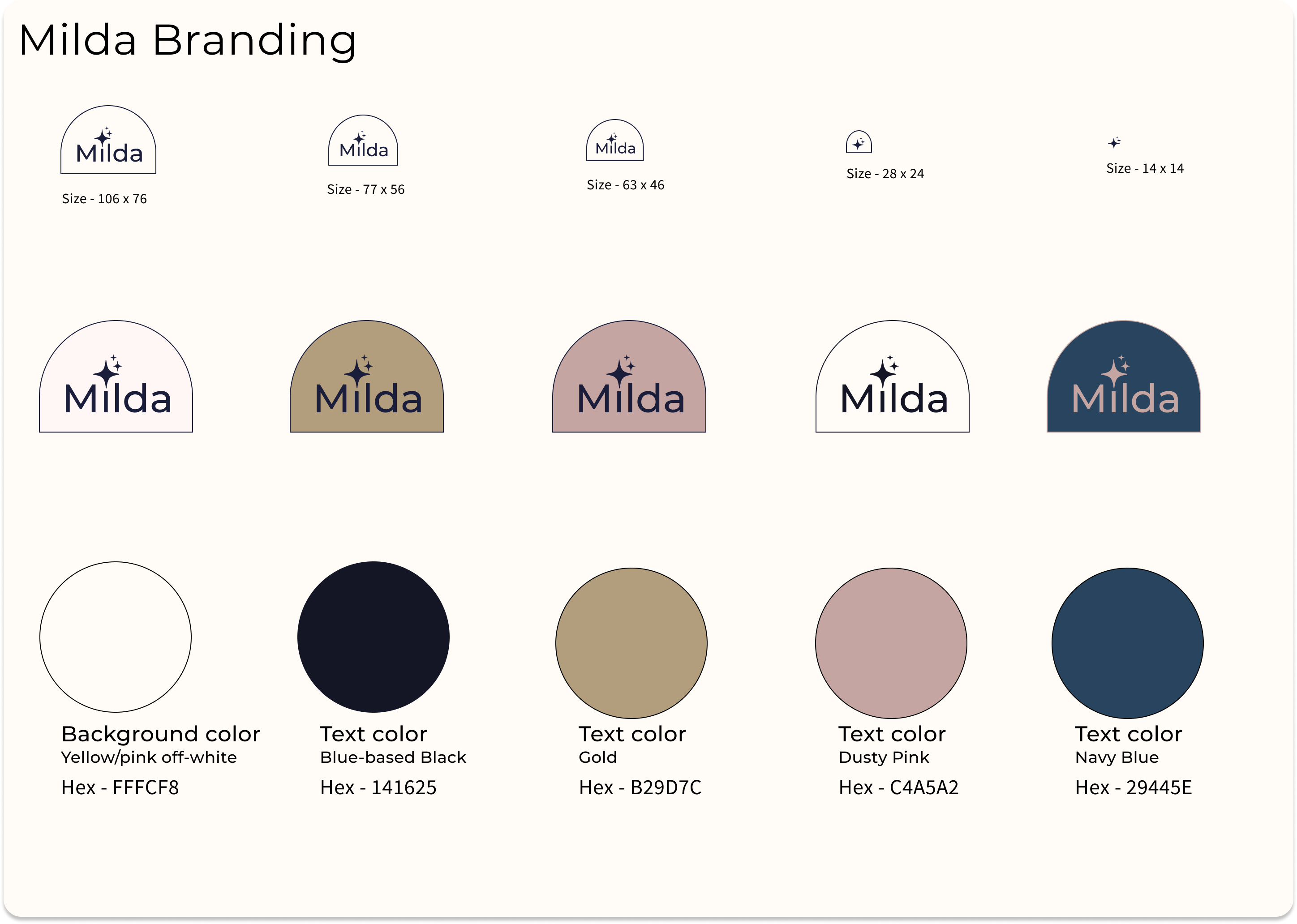
As the wireframes developed, so did the UI and branding of the product. I adjusted the logo, colors, and gradient to provide the user with the best look possible.
The brand logo changed to become more clean, and the light blue color was chosen due to how well it would contrast against the pale yellow background.
Color and type were updated to keep the design looking clean and spa-like, to better reflect the earlier moodboard.
Hi-Fi Design
During the design phase of this project, I was meeting with the Product Manager on a bi-weekly cadence, to present my work in progress and iterate on any identified pain points.
Validate
Testing with our users
I met with five users over three days.
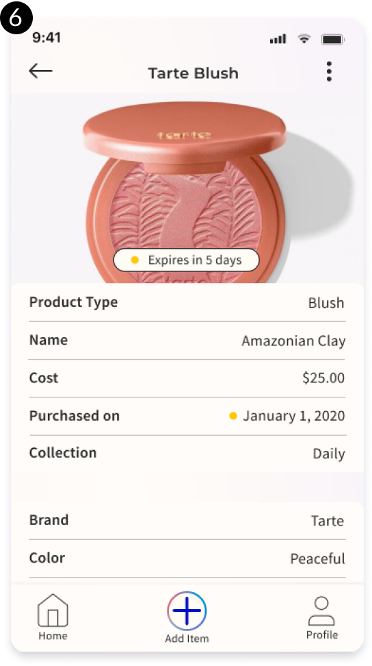
All users felt confused by the expiration alert feature; they expressed being unsure about how many items were expiring per category.
What I learned:
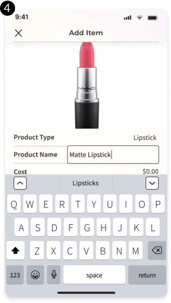
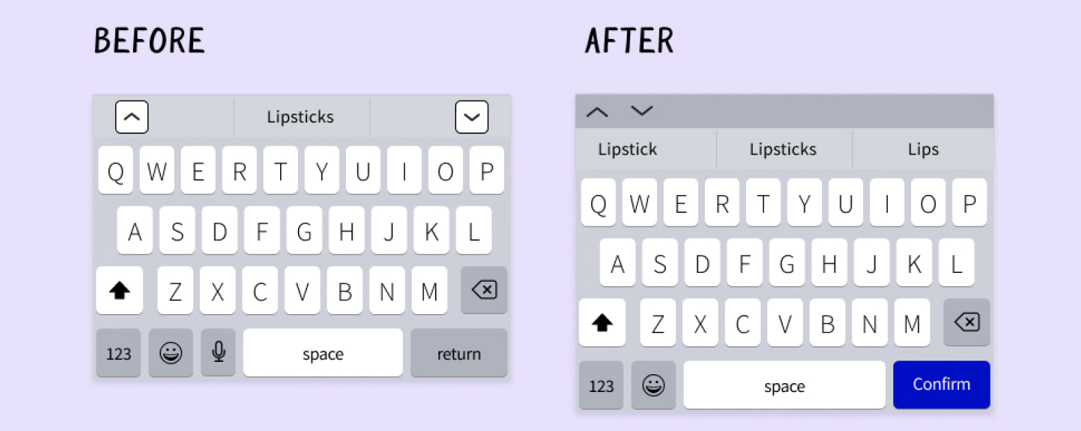
- All users struggled with the keyboard buttons.
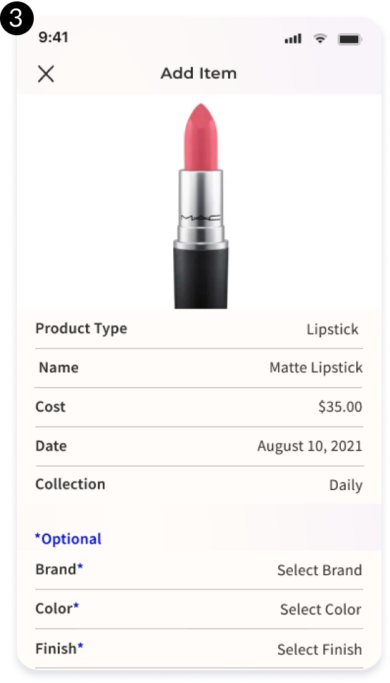
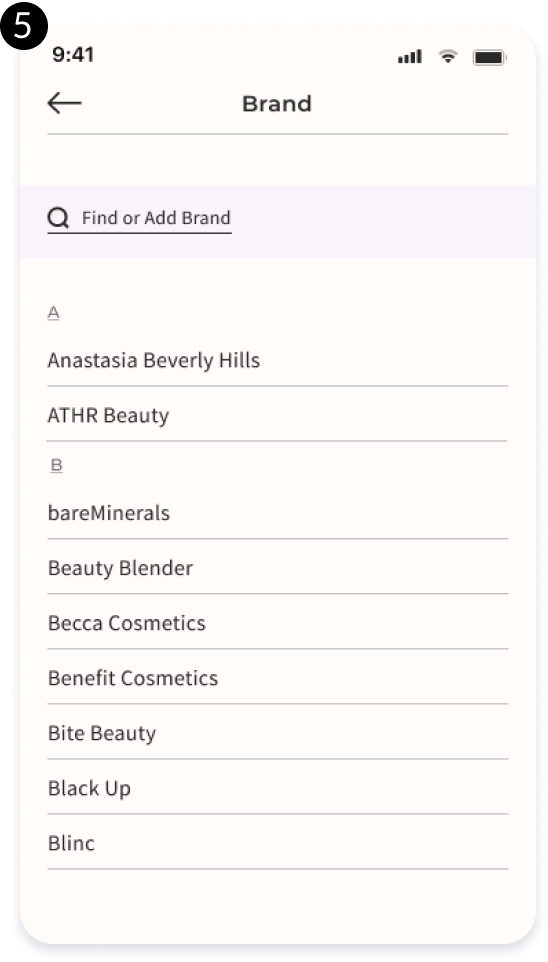
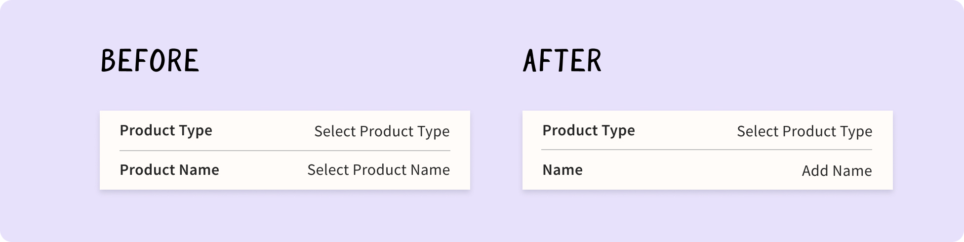
- Some users expressed confusion over the naming of the category fields Product Type and Product Name.
- Four users were uncertain about the wording on the app's home page, as well as the text on the home button.
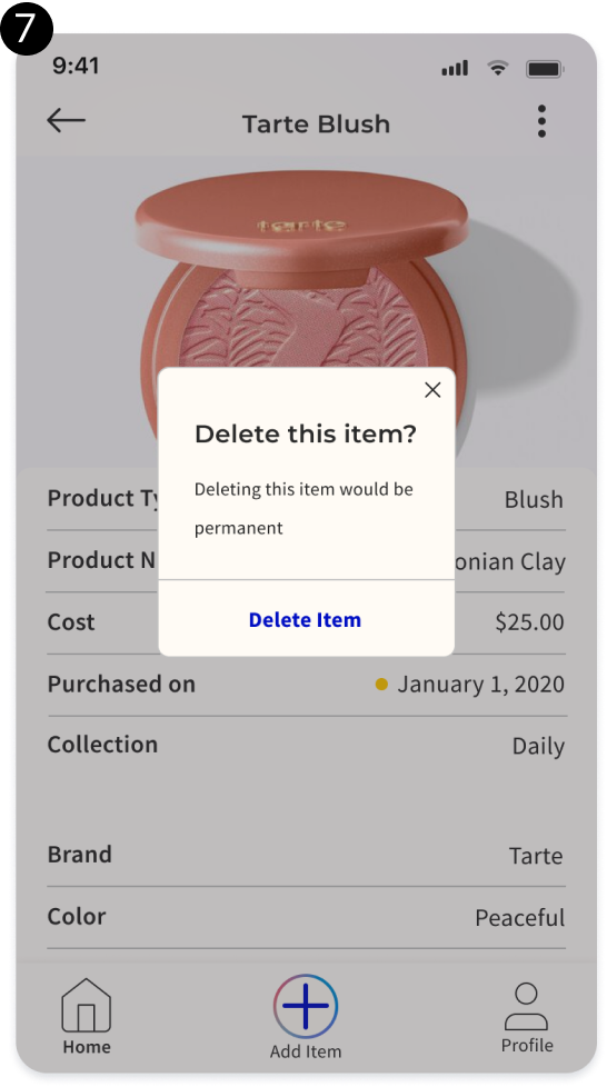
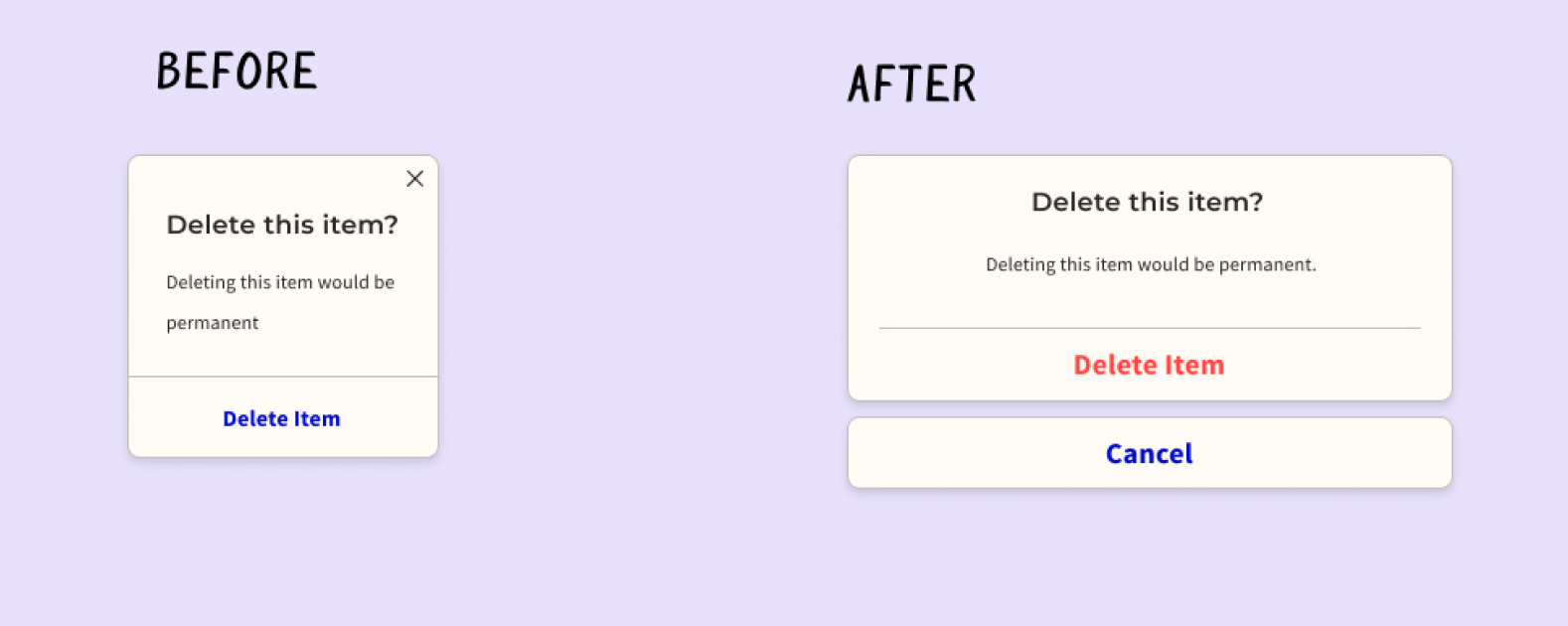
- Two users inquired about how to back out of the presented modal after clicking the delete button.
- One user requested the ability to duplicate an existing item entry, for the use case where they've purchased an existing item in a different color.
- One user suggested being able to share items with friends, or making individual profiles for others in the household.
The Revisions I Made:
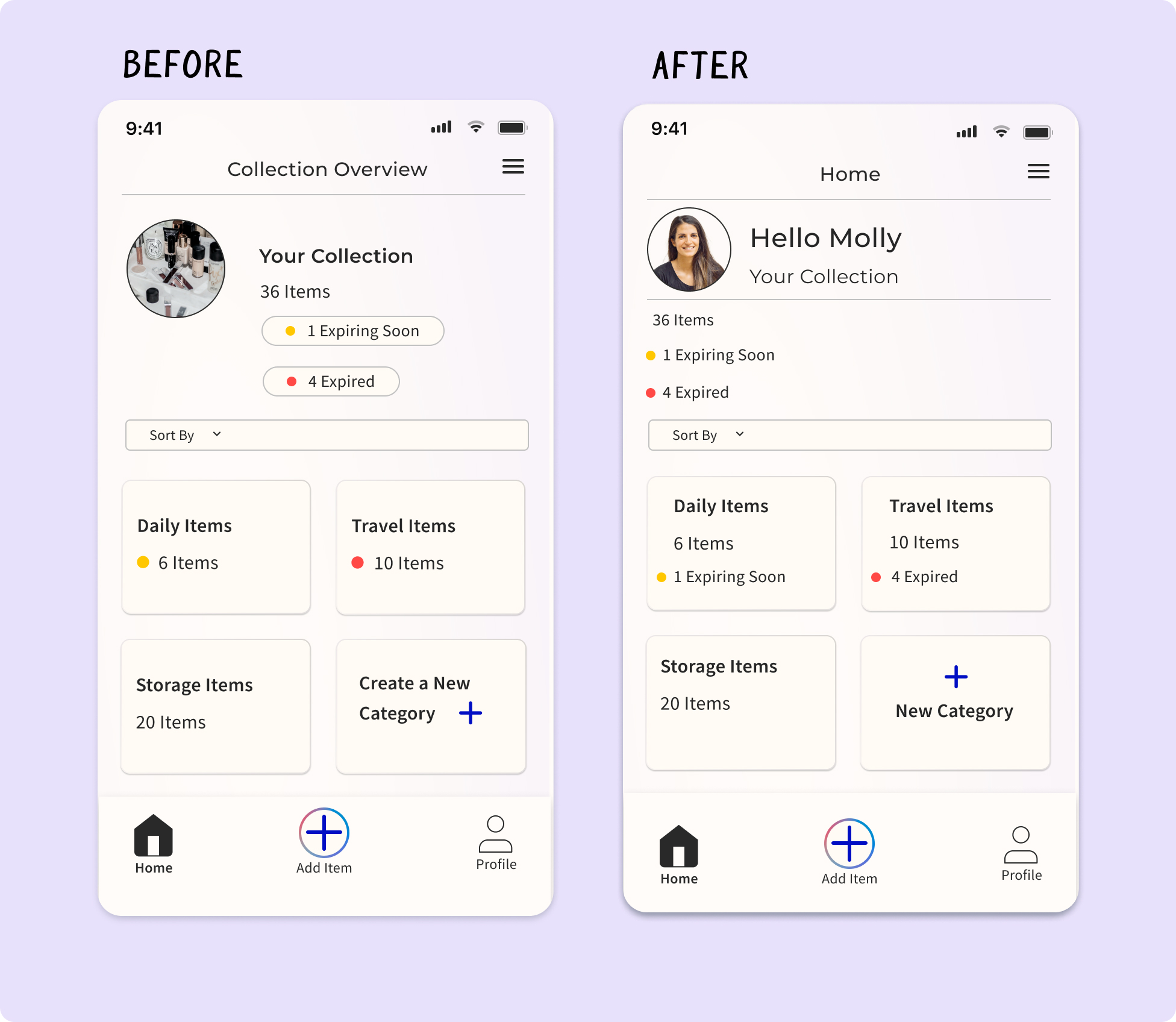
Home Page
- I changed the header text to Home, so users would more clearly understand that they were on the home page of the app.
- I added back in a Profile Image and Name, to allow for different profiles and account sharing through a potential future update.
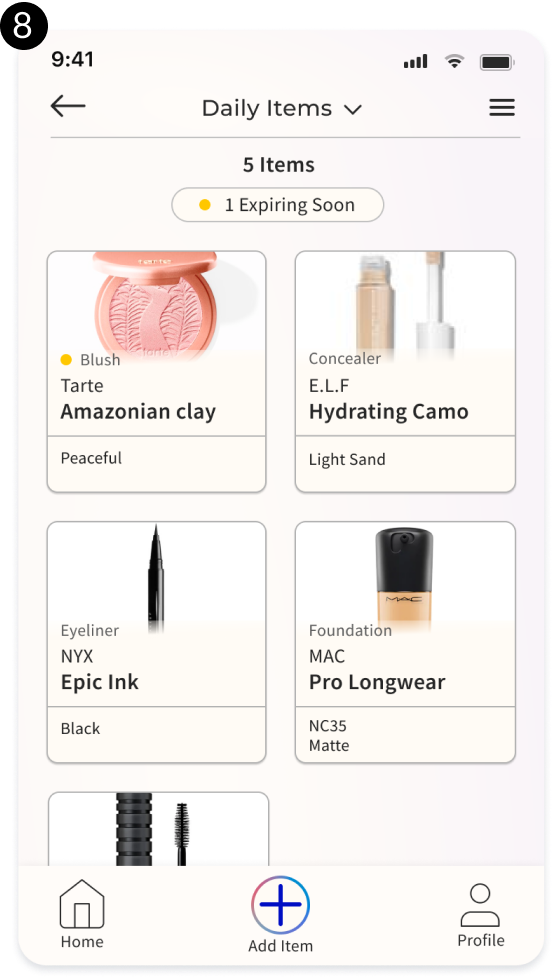
- I left-aligned the stats of the user's collection. This would make it easier for the user to scan this information.
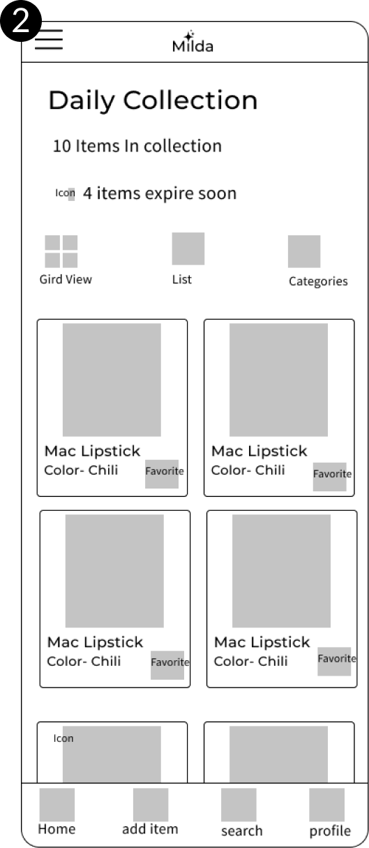
- I added the quantity of expiring items directly on the collection cards. This would more clearly help the user see how many of the items in a collection were affected.
Delete Modal
- I added a cancel button below the existing delete item confirmation button. This mirrors the design language used by Apple's iOS software, and helps prevent accidental item deletions.
Keyboards
- Users were having trouble closing the initial version of the keyboard, so I added a confirm button.
- I also made the up and down buttons grouped and left-aligned, which mirrors Apple's iOS design.
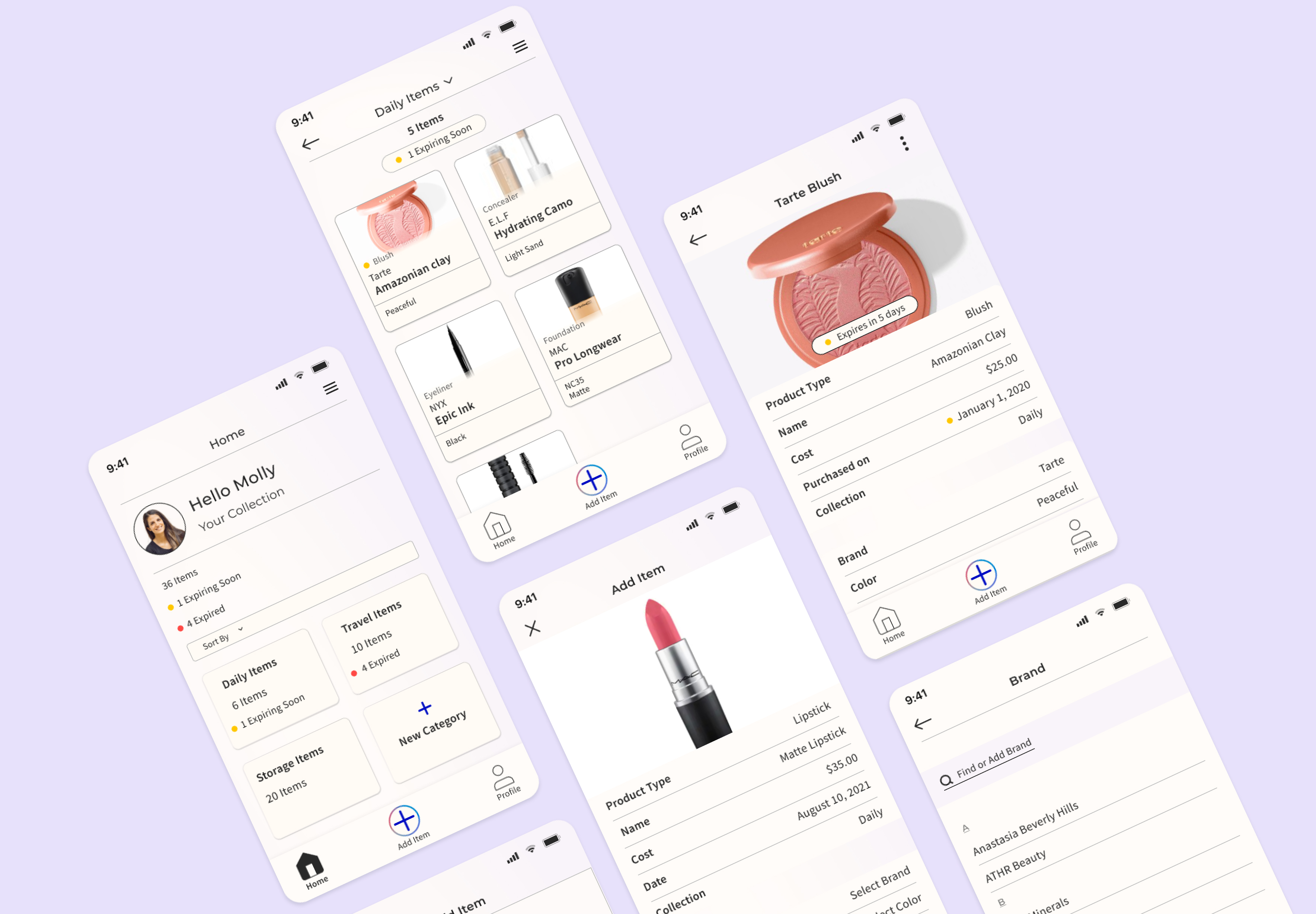
Final Design
Thanks for reading!
Here's a few more of my case studies.
Mean Street Tattoo
A responsive website design for a tattoo shop, where the artists can showcase their work and allow their clients to book appointments.